Frequency
Client
Mc Court Global
Services
Brand Identity
Year
2022
Team
Piedad Rivadeneira
Simón Sepúlveda
Pau Geis
Our friends at Unfinished Labs might have found a solution to Big Tech: Frequency is born to challenge the power of social media giants and surveillance capitalism by creating an open social media system that develops a public and accessible database of people’s social connections. Frequency runs on a token-staking model which – sparing you the nerdy, obscure technical jargon – allows users to vote for applications that are better for society, more effective, and with a level of transparency that avoids some of the toxic outcomes that we’ve seen in the current web. Frequency makes it possible for decentralized social to scale and give developers low-cost, low-volatility access to new social media models.
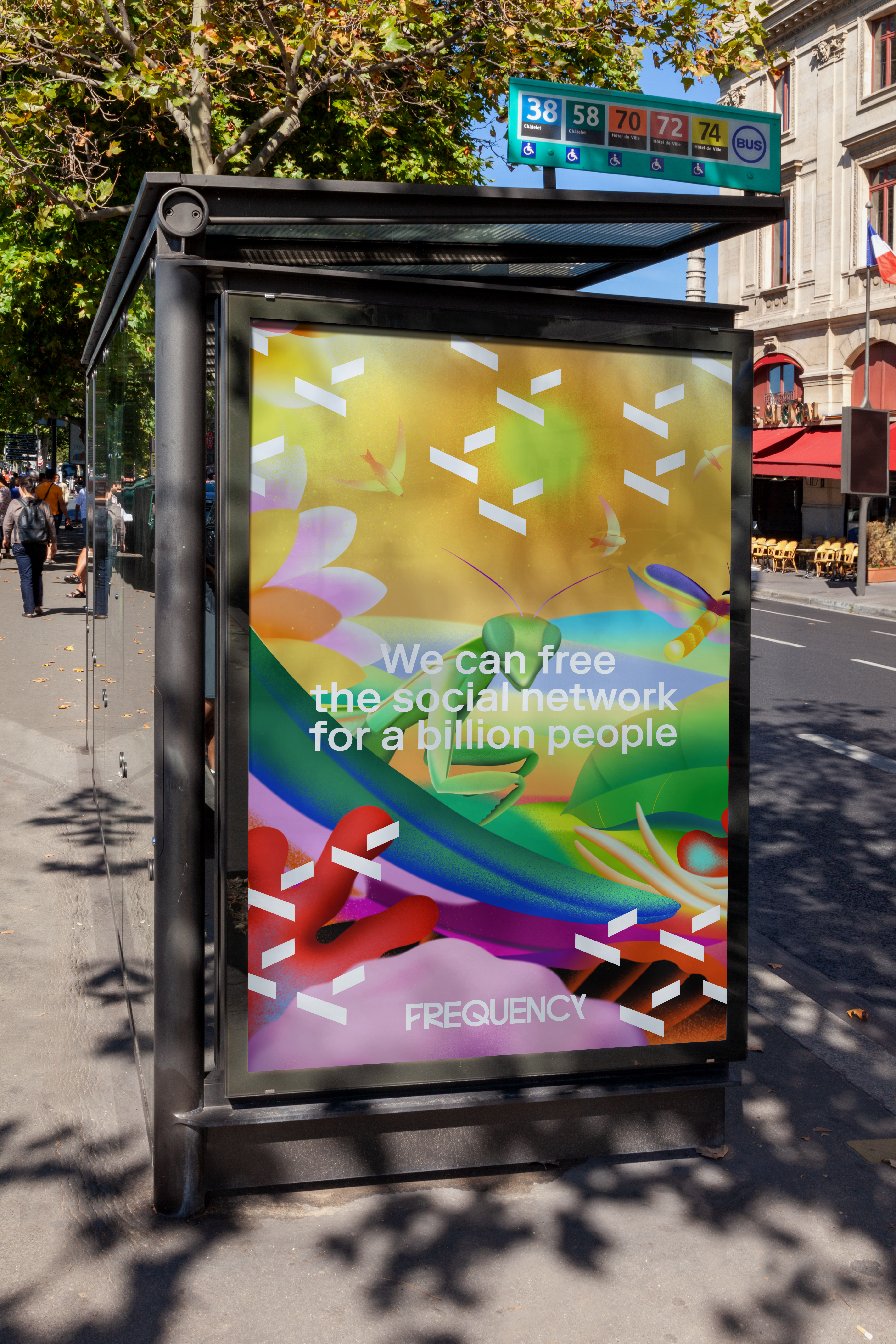
But if Frequency wasn’t yet another social network, then it was up to us to make sure it didn’t feel like one. If you think about it, it’s not just that every social media has the same look – it’s that they also contaminated our whole landscape Everything looks like a tech company now. So we had to go off the unbeaten path to develop a new language that would embody the web spirit of the platform, while at the same time fleeing from the strict and dry visual universe of flat design, geometric illustrations, synthetic logotypes.
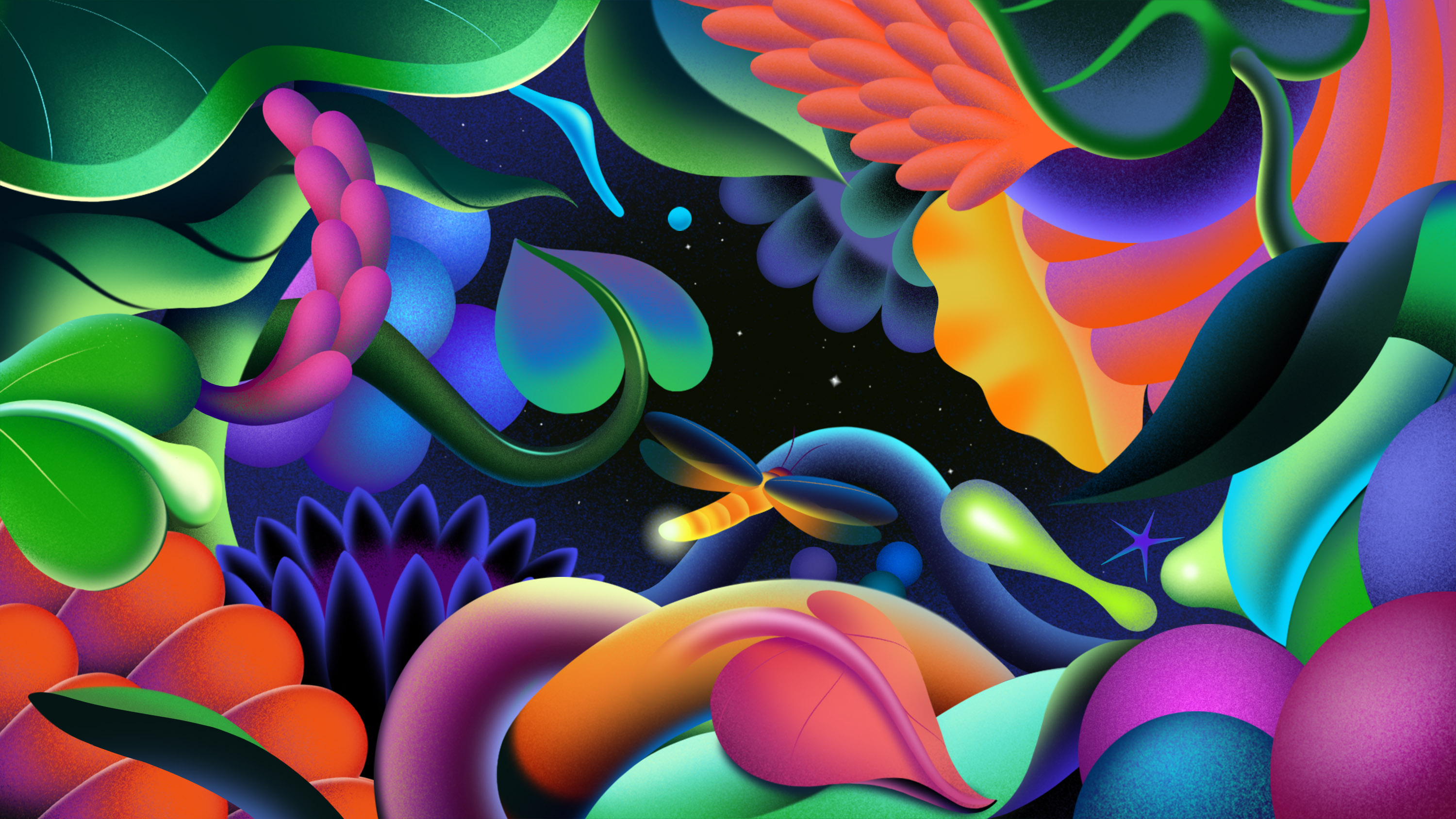
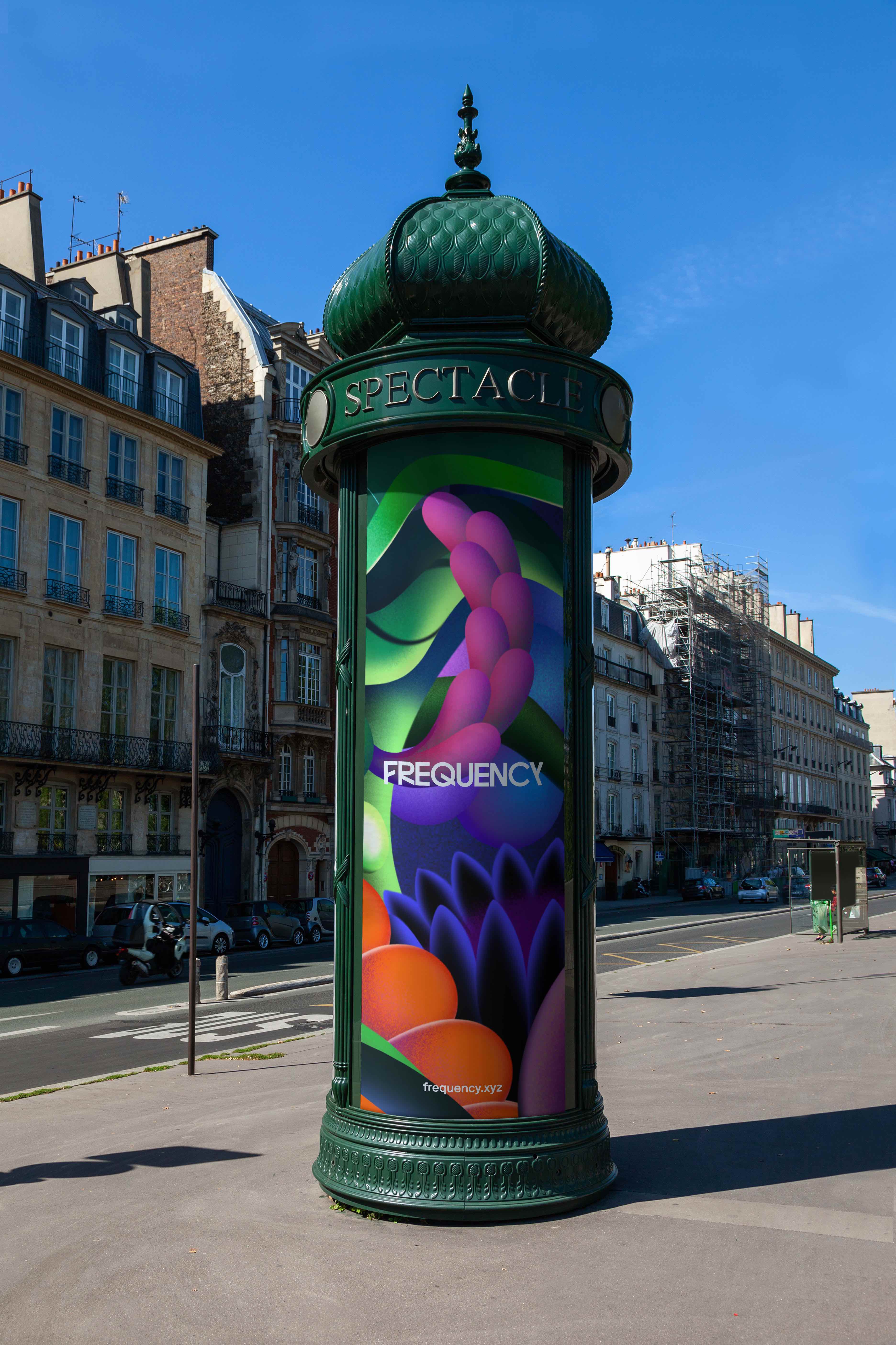
We wanted the branding to evoke resonance, influence, oneness, and a sense of community. The key concept was decided: biodiversity perfectly represented the concerns of social media, evoking the spirit of preservation and diverse forms of coexistence. As we set foot in such a semantic world, everything began to align. In terms of art direction, we went for fresh, exuberant, and colorful illustrations (goodbye, simple shapes, flat colors and pared-down color palettes!). Our art direction needed to be a Cambrian explosion: forest and jungles, plants, bugs and animals, water and wind – our approach needed to flee from a gray, tech-y world, while at the same time entering a realm evoking Frequency’s futuristic approach. So long, dystopian flat illustrations.
