Unfinished
Client
Mc Court Global
Services
Art Direction
Brand Identity
Content Direction
Film Production
Narrative and voice
Year
2021 – Ongoing
Team
Piedad Rivadeneira
Simón Sepúlveda
Christopher Cea
Sandra Serra
Antonio Blondel
Daniel Torres
Mauricio Loyola
Alfredo Duarte
Isidora Jiménez
Unfinished is an impact network and global platform dedicated to new solutions and changes in modern society. An enterprise whose goals revolve around generating financially measurable social impact and empowering communities through creative media, new technologies and a savvy vision for the digital age. Connecting leaders in technology, academia, social impact and the arts, the organization puts together technology labs, arts initiatives, an annual conference, among other things. Diverse realities, a wide spectrum of partners, changing communities, and shifting goals – how could this identity be static, rigid, logocentric? Instead, our approach has to be flexible, adaptive, ever-changing. Multifaceted, instead of limiting. Empowering change instead of constricting it. No, one logo doesn’t fit all. So, let us sum it up for you – Unfinished is innovation, thought, possibilities, art, laboratories, conferences, governance, democracy, technology, economy, ideas. The branding system should embrace our current reality and celebrate imagination and evolution, and be in itself a catalyst of change. Something that asks to be altered continuously, instead of remaining static.
Unfinished commissioned us to design their overall image: creative direction, brand identity, digital design, animations, content production audiovisual direction. We found our keystone in the concept of potentiality, creativity, evolution – an inviting incompleteness, a space to fill, a road that has not been taken yet. Something unfinished, as a matter of fact.
Once we had the name, we could build a whole visual and narrative system around that key concept. Urban environments, digital bridges, intermittent diagonals, flashing cursors, generative passageways – this is what the visual code should evoke. An inviting missing part, a gap asking to be filled, a path to be walked. A space that hasn’t been filled. For possibilities, for imagination, for new ideas. Fleeing uniformity, embracing differences. A construction sign, a code of urban activity. A system to be built, interdependent and connected. One that never ends: unpredictable, unlimited, unfinished. (Sometimes explaining design inspirations is a bit like paraphrasing poetry– kinda takes out the magic – but there you go).
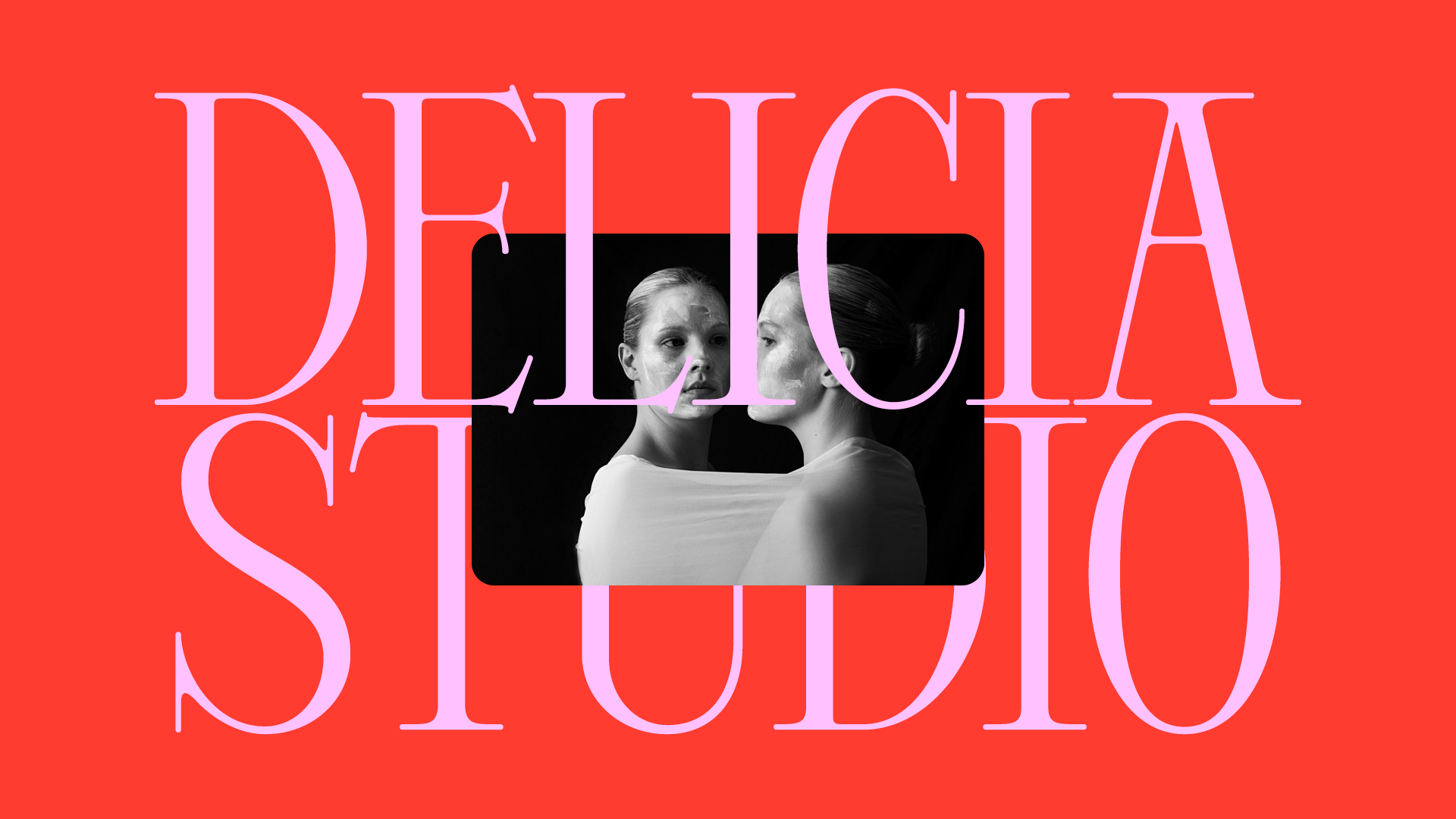
People should recognise Unfinished not because of its logo. They should feel it by just seeing a word treated in a certain way – in any of its possible outcomes, its digital or physical application, with the logotype present or not. As a global identity for an organization addressing worldwide challenges, we built a bold and powerful identity system and visual code which, at the end, serves the same goal of the organization: attract citizens and leaders, communicate ideas, and generate progressive change within our complex, ever----changing world.