Liguria Bar
Client
Liguria
Services
Brand Identity
Year
2006
Team
Piedad Rivadeneira
Josefa Labarca
Magdalena Rivadeneira
Jocelyn Quezada
Natalia Geisse
Gabriel Lobos
Rosario Arellano
Marco Cánepa

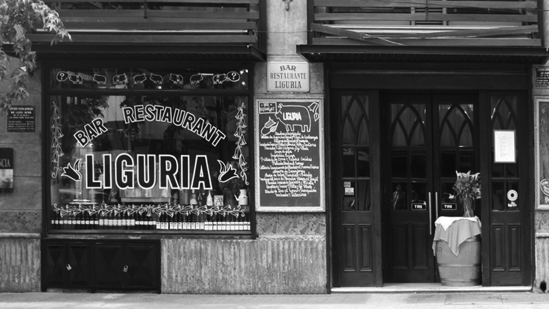
Between a bistro, a café and a restaurant, Liguria is one of the most emblematic venues in Santiago. If you’ve never been in town, I’ll paint a moodboard for you: bohemian vibes, loud conversation, colorful façade, red and white-checkered tablecloths, folk paintings, vintage adverts, Chilean memorabilia and chalked specials paving every inch of its wood-paneled closed inside. Proudly labeled as “high-decibel” by The New York Times, Liguria is a gem on the Santiago restaurant circuit, a concocted spot for popular food and exquisite wines served by old-school waiters. Founded in 1990, it quickly became a national icon, a pop culture venue (pop as in popular) of Chilean lifestyle, a symbol of democracy, the rendez-vous for those who love to celebrate history, memory, food, drinks, and music in a chandelier-lighted dining room.
You can tell how honored we were when we were asked to redefine its image. And, after the honor, came the question: how do you design the image of an icon? A place that is an emblem of a certain Chilean way of life, loved and frequented by its community. It was like redesigning the national flag, writing a new season for a classic show, changing the shield for the football national team. We had to play our A-game to meaningfully evolve something that was already loved and present in people’s minds. As it happens, we realized we had to look no further than our own history.
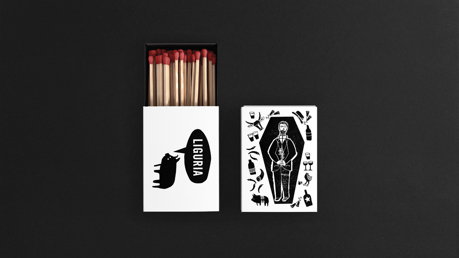
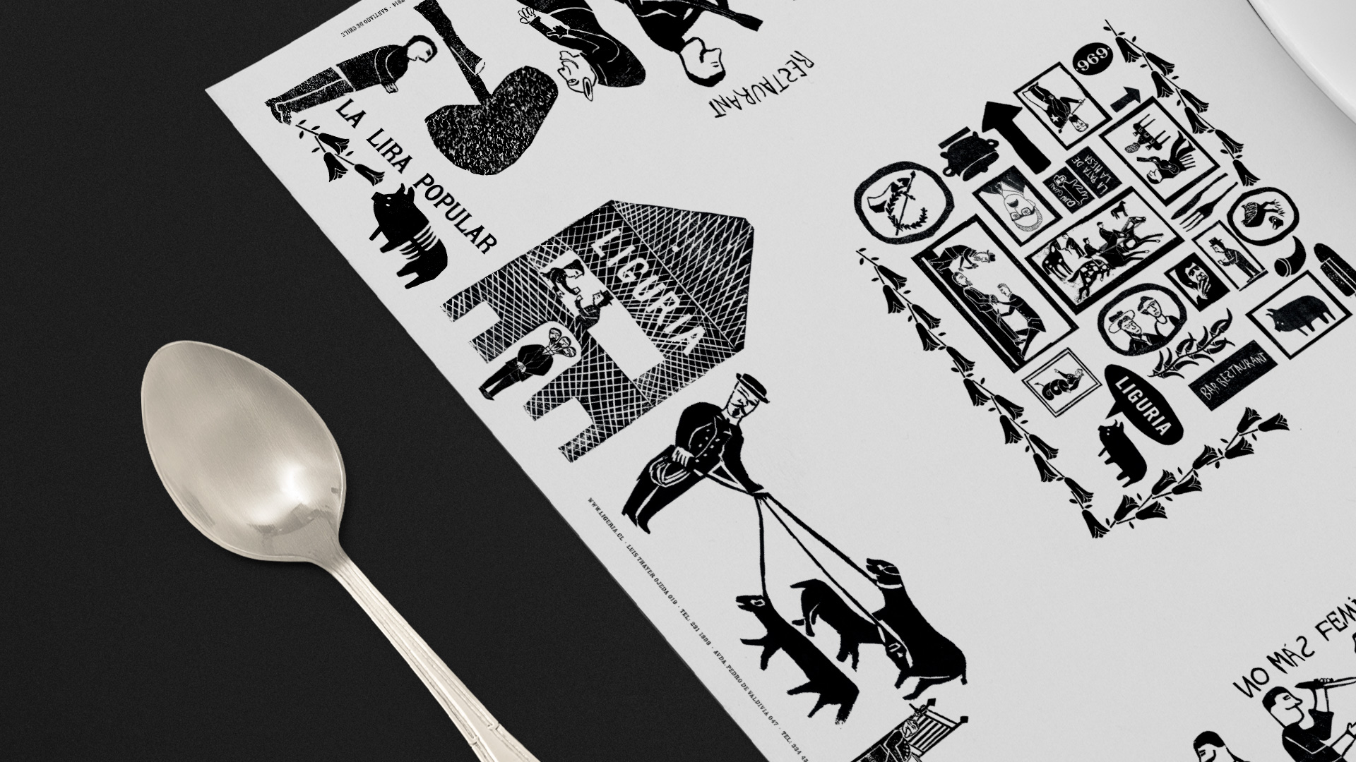
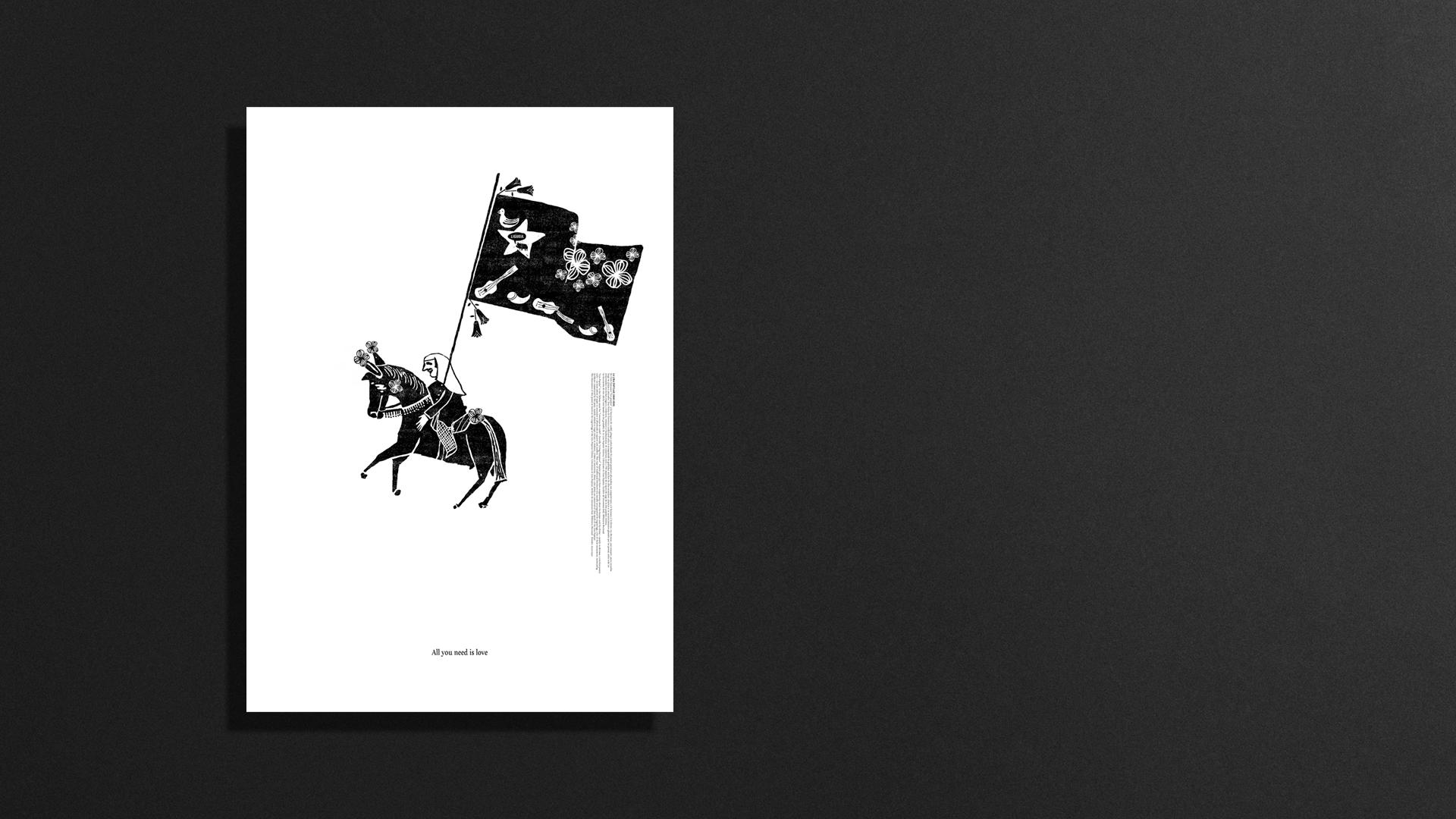
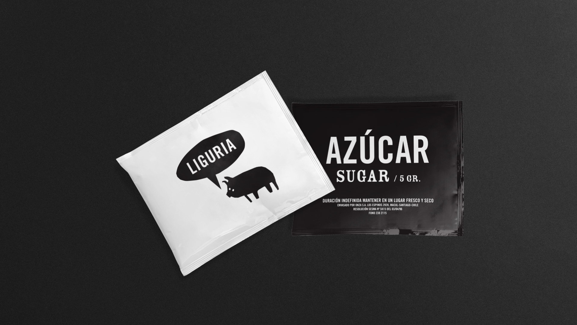
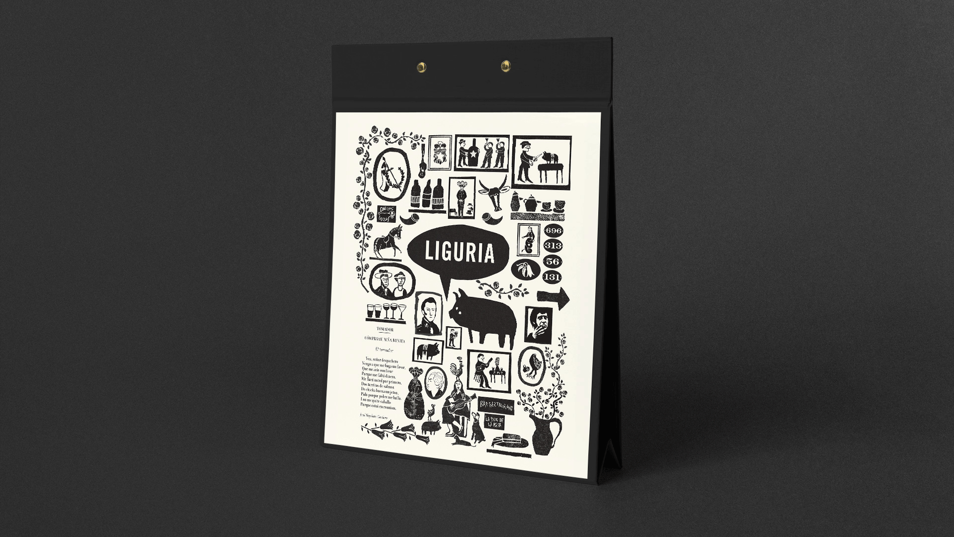
We built the visual image of Liguria around the Lira Popular Chilena, a style of poetry written and printed in Chile in the late nineteenth- and early twentieth- centuries. In Lira, poets commented on the experiences of the time in loose printed sheets, usually left hanging on trees or sold with loud shouts in streets, markets and railway stations.
And as it was mostly spread to an illiterate segment of the population, they included graphics and drawings for buyers to be attracted by the images and to gather and listen. What made Lira Popular very special is that the drawings were usually designed by the poets themselves. It was popular literature that jumped out at you, provoked and demanded the gaze of the public – both readers and spectators. Yes, spectators, because Lira Popular is literature in (typo)graphic words and symbolic images embedded in language. It was made by both peasants and poets to comment on news or social events through a visual language so as not to exclude anyone from the conversation. The result is a fascinating understanding of the plastic virtue of words and the visual as a rhetorical device. Titles of Lira popular are interestingly similar to titles in newspapers today, with large fonts and visual hierarchies to catch attention — in other words, a nineteenth-century Chilean poet’s version of clickbait.
We immersed ourselves in deep research, and emerged with all the imagery present in the Lira Popular that evoked the spirit of Liguria: bar scenes, huasos, horses, guitar players, celebrations. But also: depictions of death, funerals, crímenes de pasión, and so on. We adapted and redesigned the illustrations in the original engraving style and presented them as the keystone of the aesthetic image (and soul) of the restaurant. Rooted in the popular culture of the country, the Liguria identity became organically part of the environment and, more importantly, was loved as if it had always been there.