Palacio Astoreca Hotel
Client
Palacio Astoreca
Services
Brand Identity
Year
2012
Team
Piedad Rivadeneira
Simón Sepúlveda
Magdalena Rivadeneira
Natalia Geisse
Gabriel Lobos
Rosario Arellano
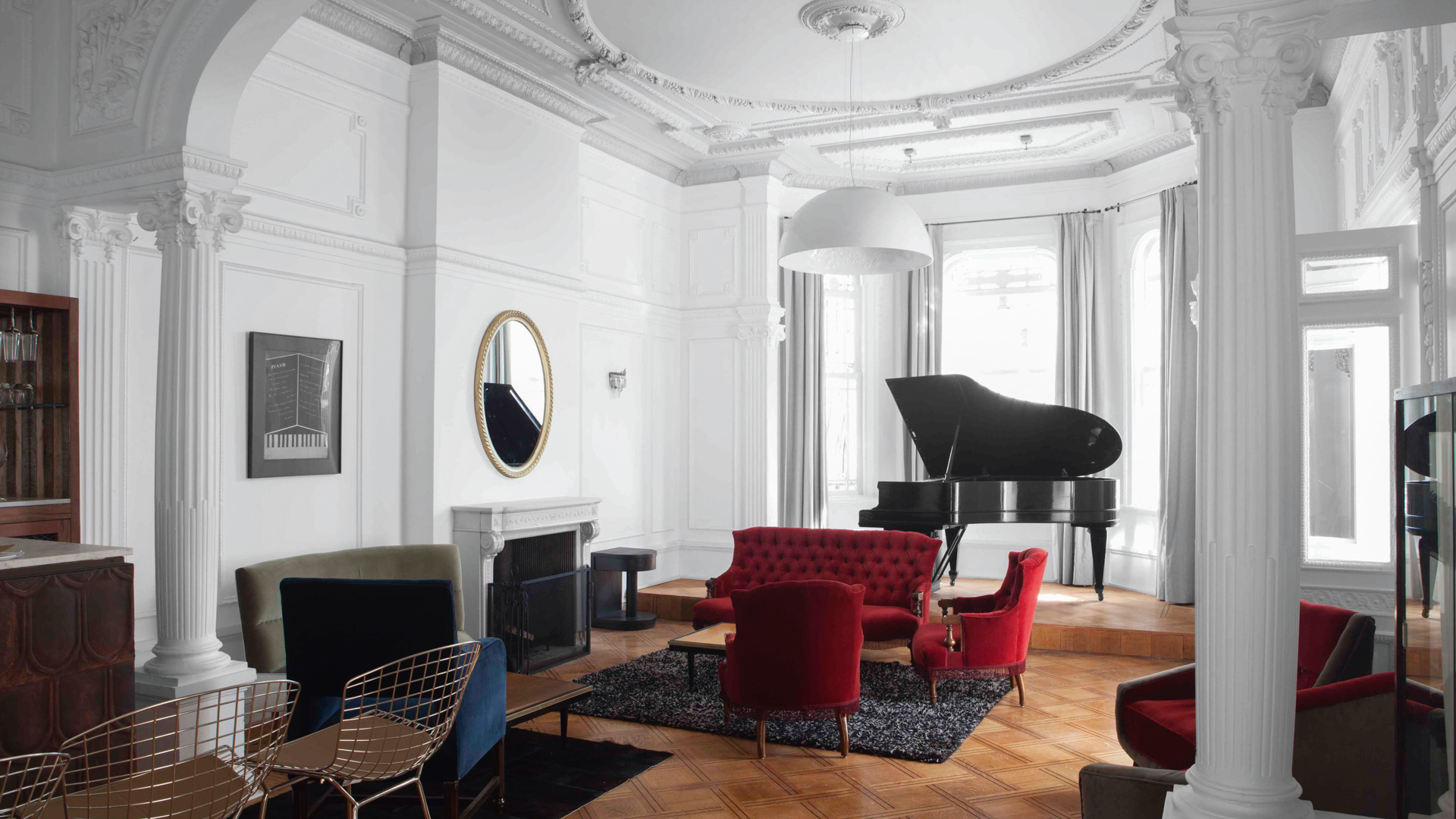
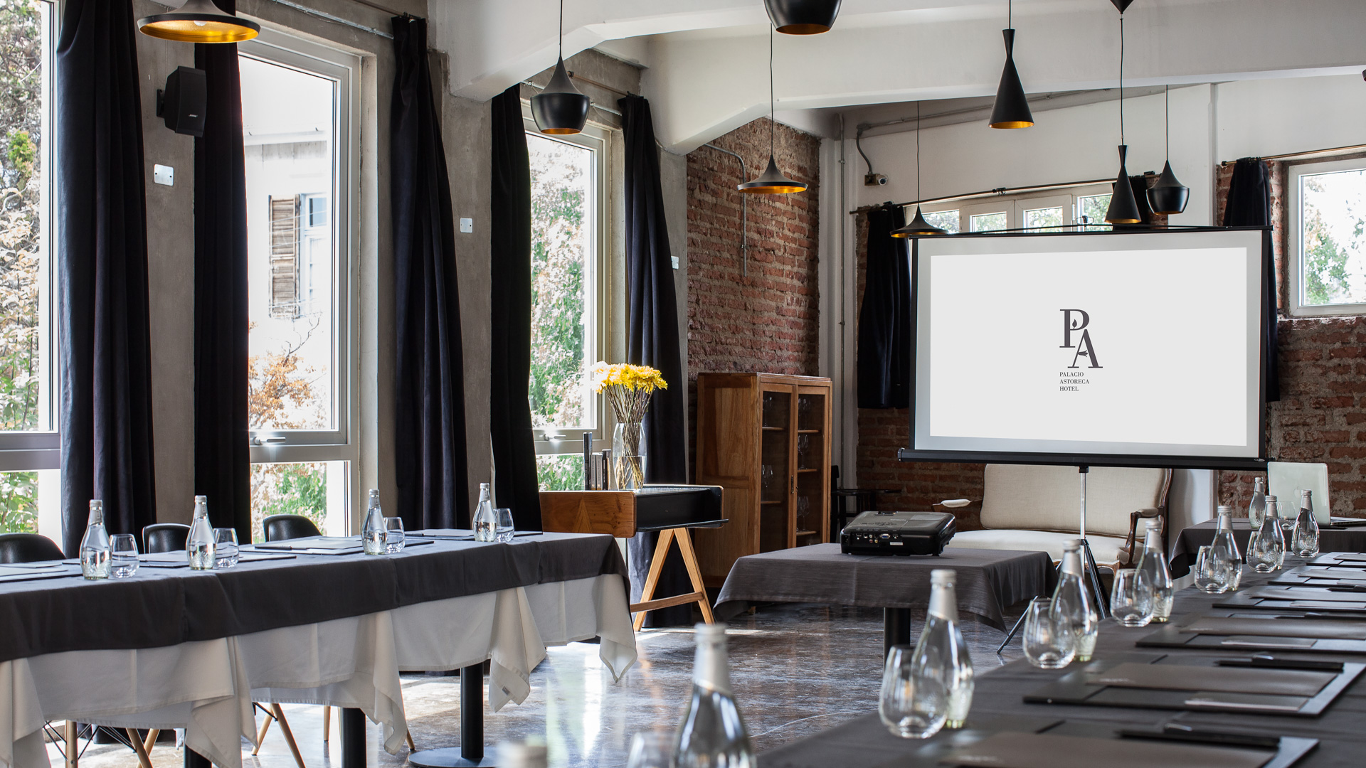
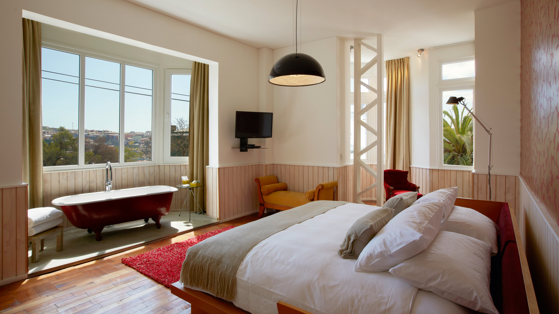
Palacio Astoreca is an historical palace built in the 1920s by a Croatian businessman on the top of Cerro Alegre, the heart of Valparaíso. The historic district is a piece of beauty - well, they didn’t make it Unesco World Heritage for nothing - and it’s characterized by its original funicular lifts, its steep cobbled streets lined, some quite sweeping views of the Pacific Ocean and, of course, its historical houses painted in bright pastels. But let’s focus on Palacio Astoreca: across the past century, the Victorian-style mansion hosted different families, a Fine Arts Academy and it was almost converted into the National Council for Culture and Arts but, plot twist, it ended up abandoned. And that’s when our client, the Swiss film producer Vicent Juillerat, fell in love with it. The Palace, which holds the status of national monument, was then carefully restored and transformed into an elegant 5-star hotel, the first of its kind in Chile. Ça va sans dire, the work was carried out to a meticulous degree, protecting the integrity of the original stucco-and-brick mansion and maintaining the original parquet floors, while adding art deco furniture and modern art. I mean, a gem.
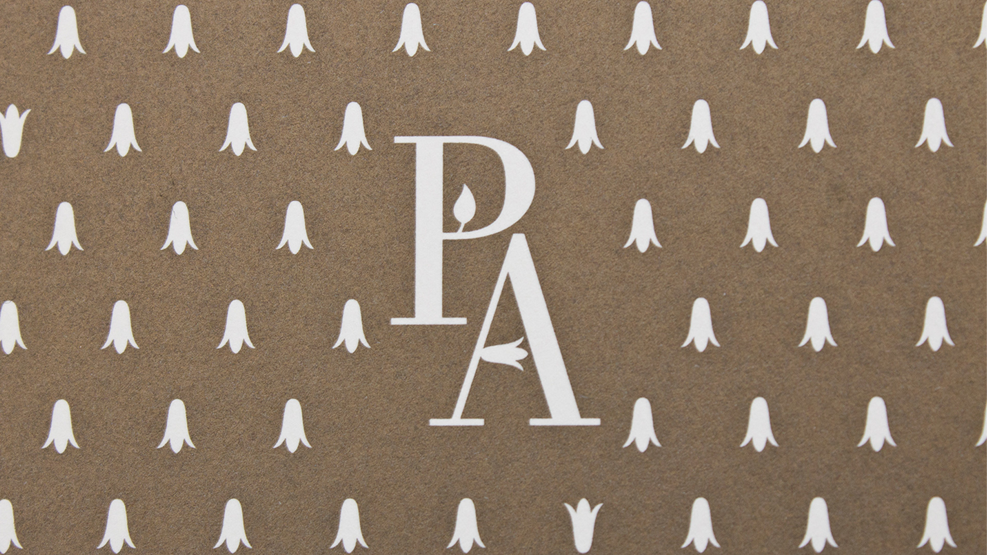
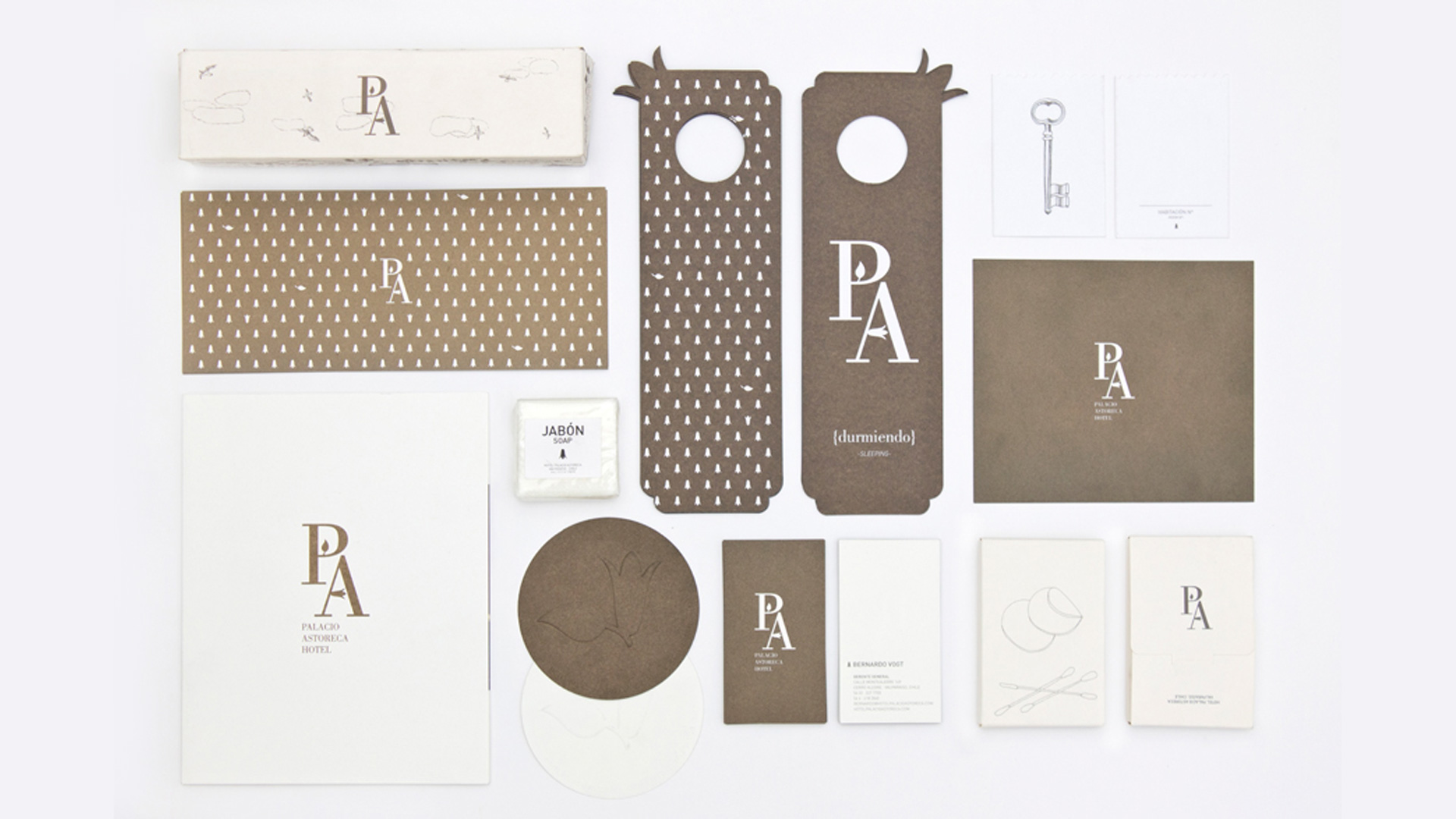
Our work was to translate its heritage, its elegance, and its essence into a classical and yet seducing visual identity, serving the exquisite sobriety of the architecture, the design of the interiors and the vision of the client.We are pretty aware that there are more rock’n’roll projects and more subtle, delicate ones—this was one of the latters. Monogramming dates back to early Roman and Greek rulers who used their initials to mark currency and other artifacts to signify their reign and build their legacy. As centuries passed, monograms came to be an indicator of wealth, luxury and status. Any family crests or fancy brands come to mind?
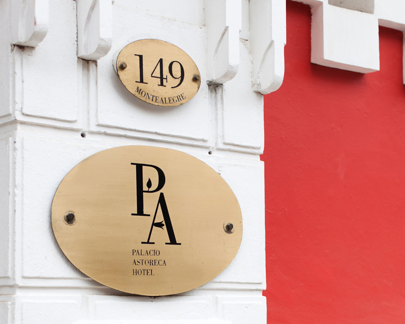
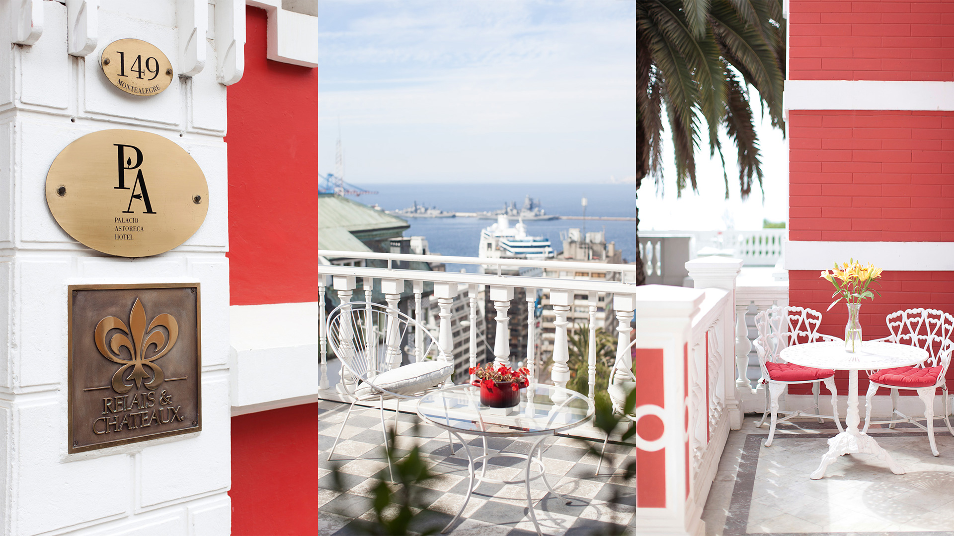
The identity revolves around a typographic and symbolic monogram, grafting within the hotel’s initials a flower of copihues as a pared back homage to the delicate vine from the interior garden. The flower is native from the coastal regions of Chile and it was named after Empress Josephine Lapagerie, wife of Napoleon Bonaparte. What we loved about it is that it is a delicate beauty that takes some special care to flourish and can’t be grown just anywhere. Alongside contemporary works of art from Chilean and international artists, the illustration portraying hills and dogs inhabits the swoonsome interiors of the hotel as well as its products, a collection of decorative elements and the general design ethos of this blood-orange architectural treasure.