Museo Interactivo Mirador
Client
Museo Interactivo Mirador
Services
Brand Identity
Graphic Design
Motion Graphic
Year
2019
Team
Piedad Rivadeneira
Josefa Labarca
Christopher Cea
Gabriel Lobos
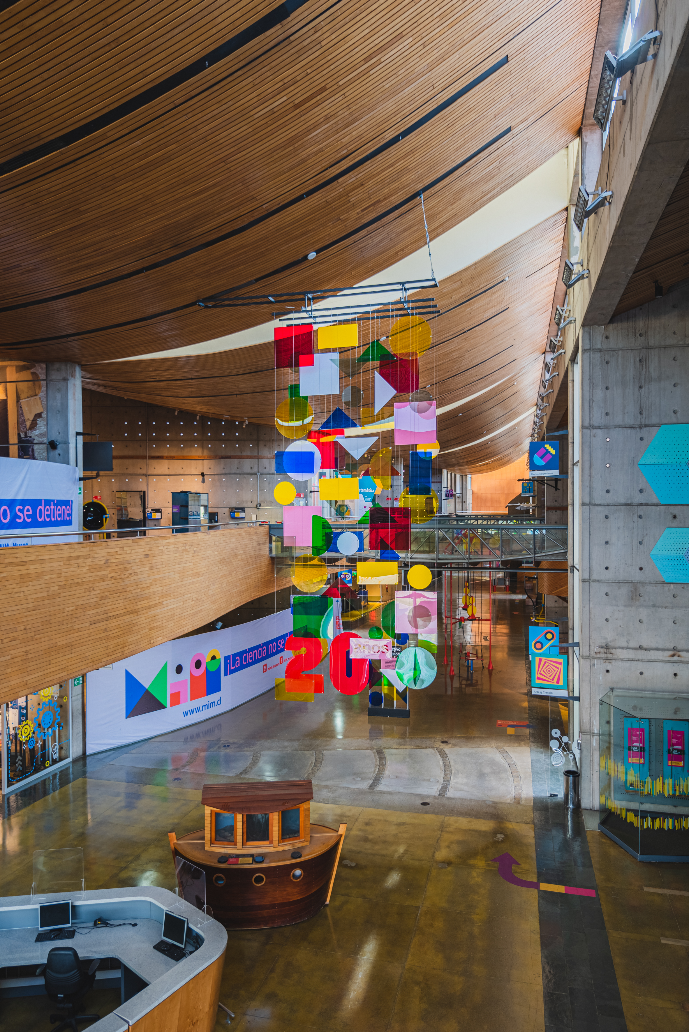
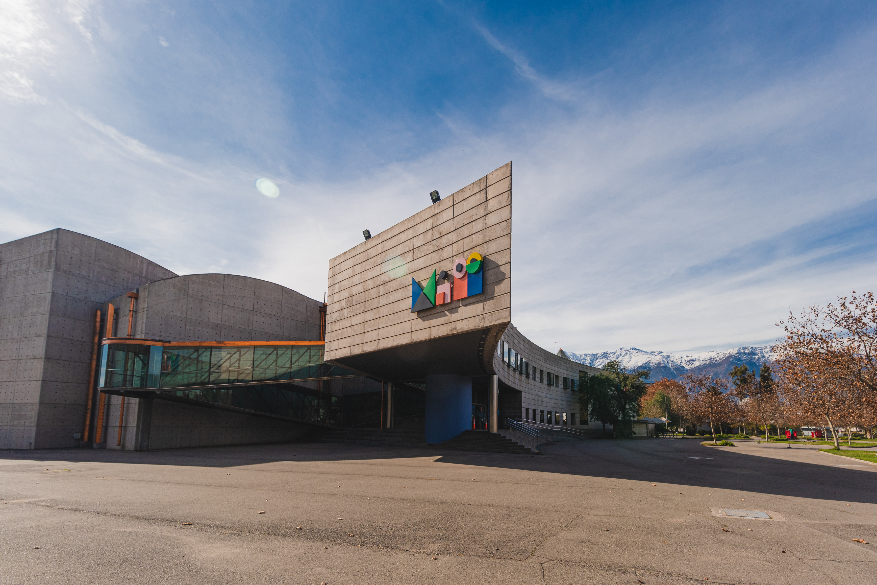
The Museo Interactivo Mirador is a massive interactive science museum with more than 350 exhibits and other types of educational activities for children and young adults. It also has a playground outside. The museum belongs to the Fundación Tiempos Nuevos, which is part of the Network of Foundations of the Presidency, in charge of the first lady of the nation. This is an inspiring place of permanent innovation we are talking about, with a playful and entertaining approach to science and divulgative action. Kids love it, of course, but from teenagers to gents its educational proposal makes it a dynamic and lively place, evolving and growing at every visit. Hosted within a 7,000----square----meter Brutalist----style complex, the museum is one of those places that feel as vanguardist and pioneering as when it first opened its doors, 20 years ago. Except for their previous identity, maybe.
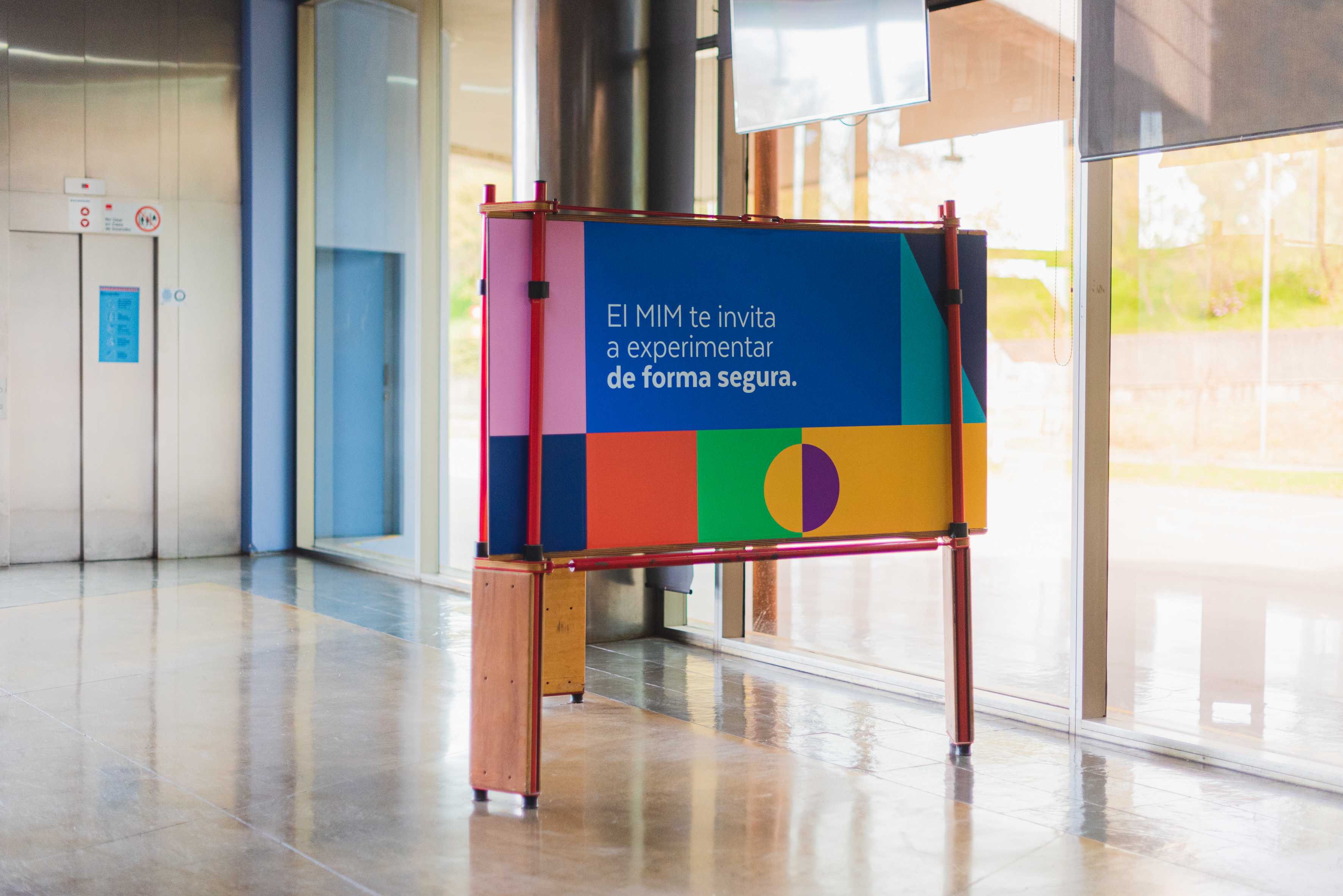
Two decades on, the museum direction wanted to adapt its visual image to reflect its contemporary vision of innovation, inclusivity, environmental activism and transversality. In our mind, the new identity should represent what the museum will be, instead of what it had been ---- with a dynamic logotypic system that could express playfulness and curiosity.
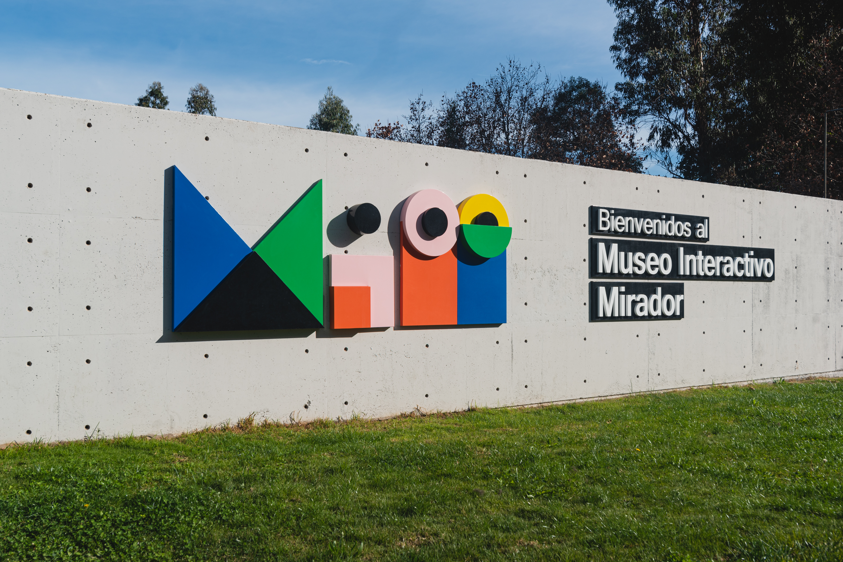
The old logotype featured a traditional pictogram plus wordmark system, kind of obsolete (can we say that?) for a pioneering museum. We decided to take MIM to a more kinetic and adaptive communication system, one that would seamlessly dialogue with different channels, platforms, and uses. So we set off to build a system of modular elements apt to fulfill the necessities of a contemporary brand.
But you know what? The previous identity represented the face of an otherworldly being whose eyes, hiding behind their hand, looked curious, explorative, in awe ---- and we kind of loved it. So, even though our branding has a completely different appearance and design approach, we kept that conceptual input to shape a more abstract logotype system, one that is open, dynamic, that inspires the viewer to complete it with their imagination. A lively, colorful entity that might look slightly odd at the beginning, but then it turns out to be welcoming, entertaining ---- and maybe even worth----loving. Kind of like the museum itself.