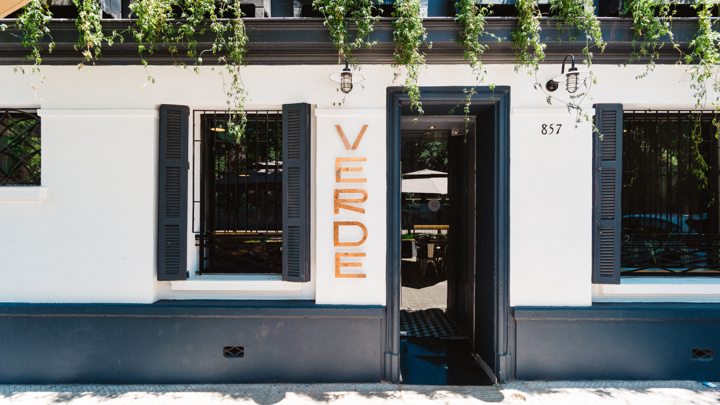
Verde Sazón
Client
Verde Sazón
Services
Brand Identity
Year
2021
Team
Simón Sepúlveda
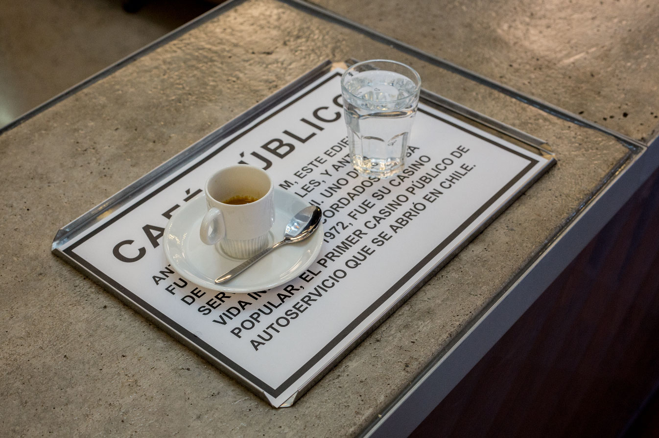
Verde Sazón is not a normal restaurant – it’s a place for constant change and experimentation. As an ambitious contemporary vegetarian and vegan restaurant, Verde Sazón is relentlessly working on developing new creative and delicious recipes and combinations for their increasingly growing (and hungry) guests.
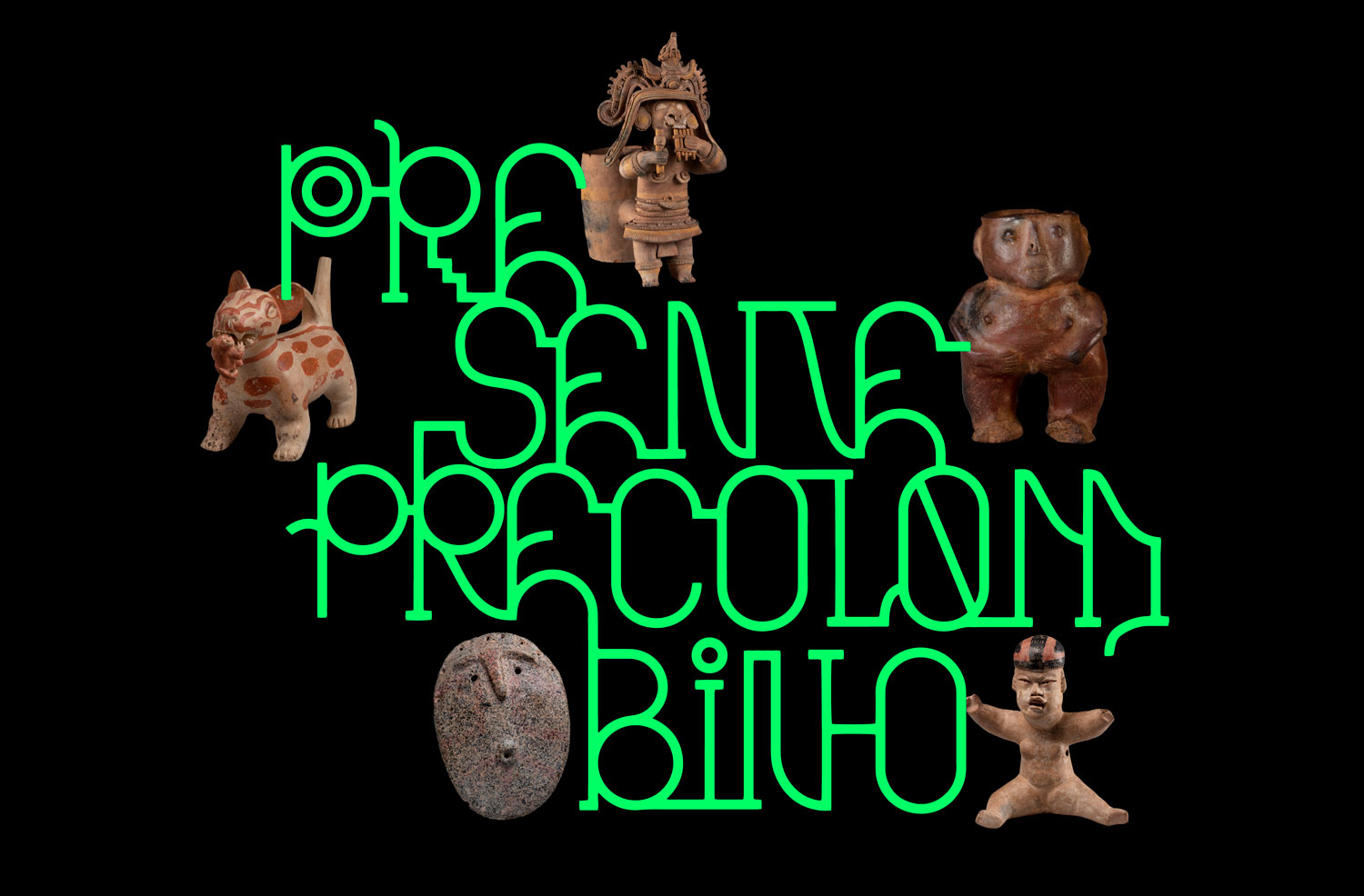
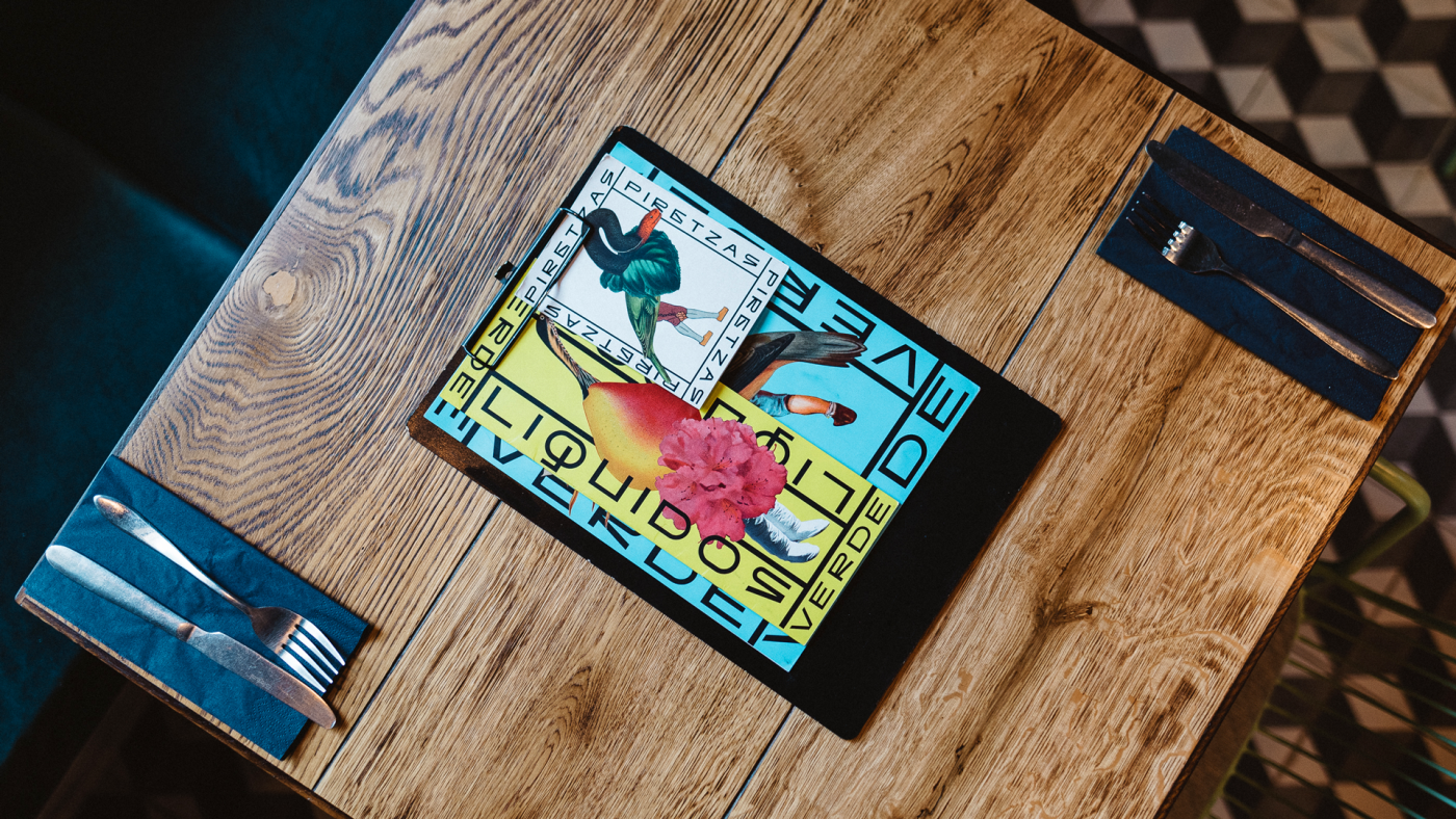
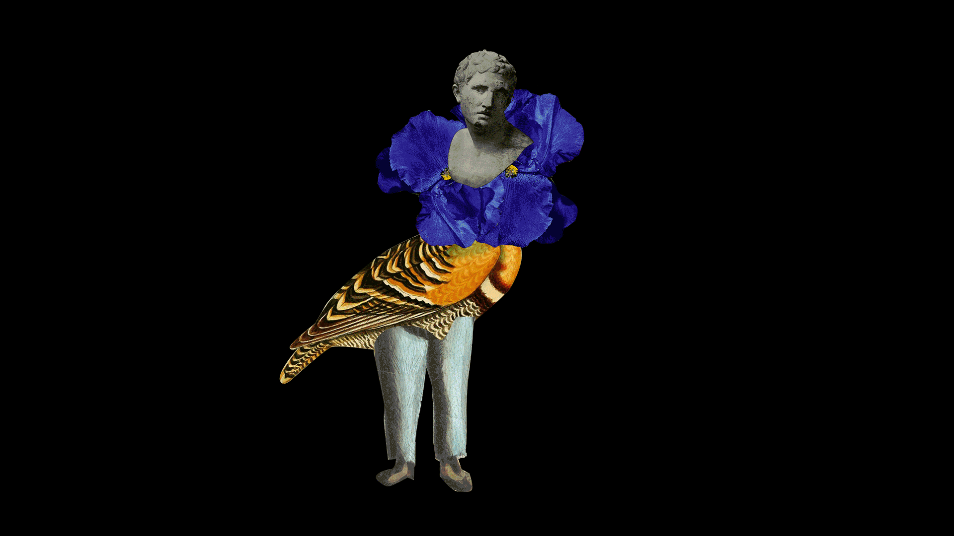
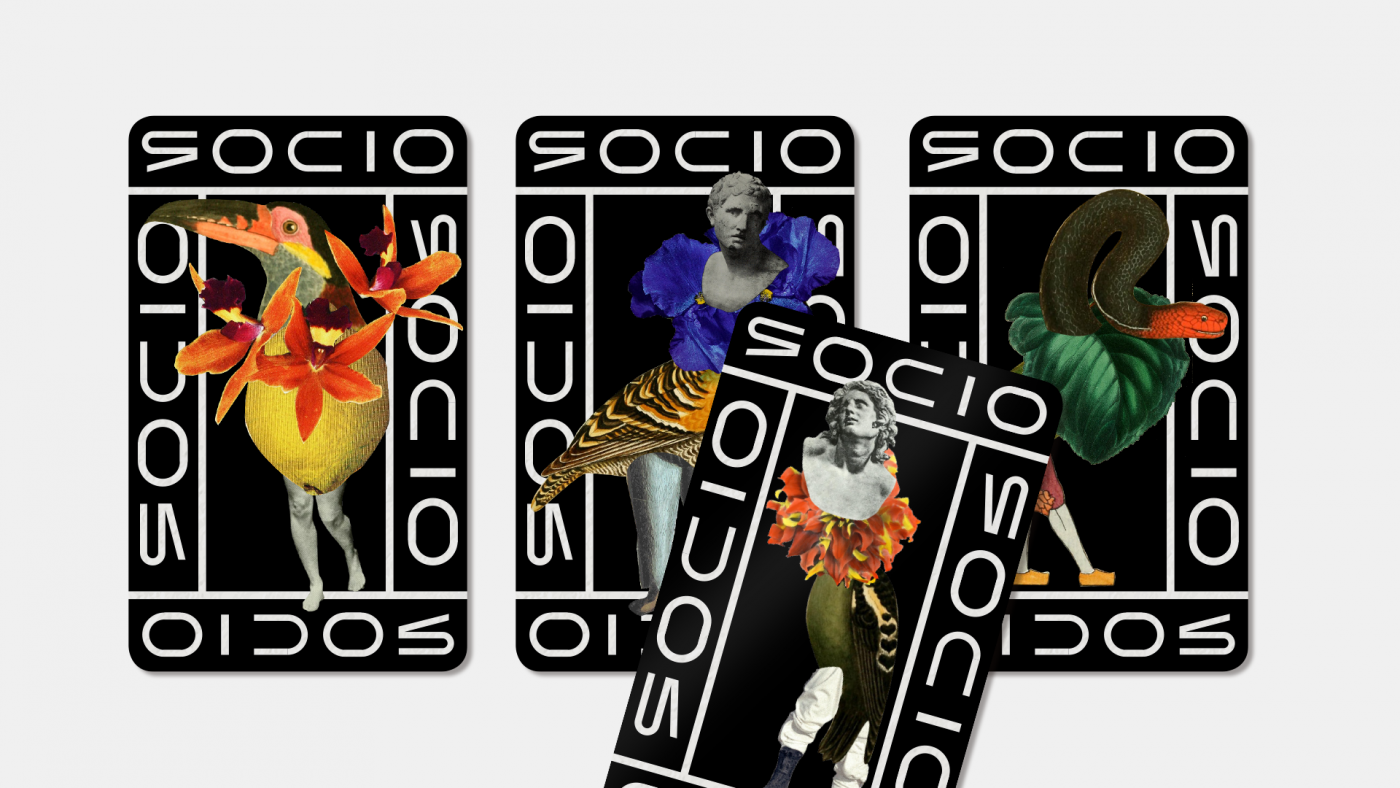
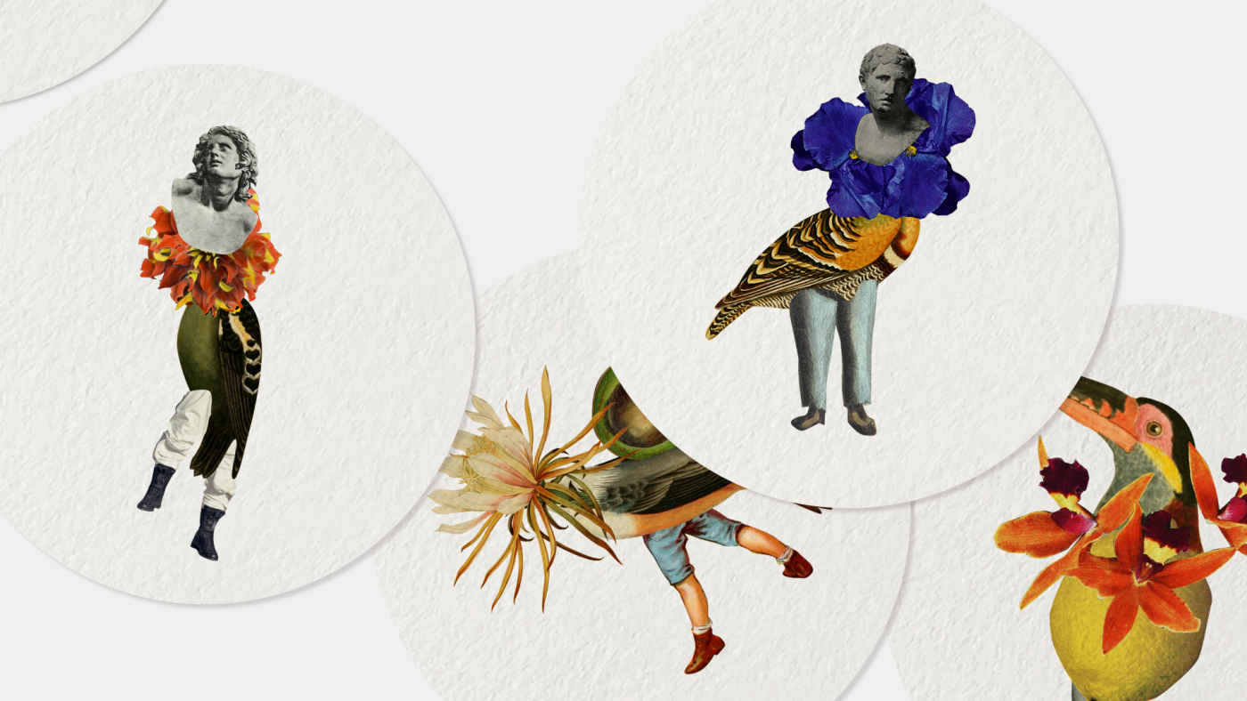
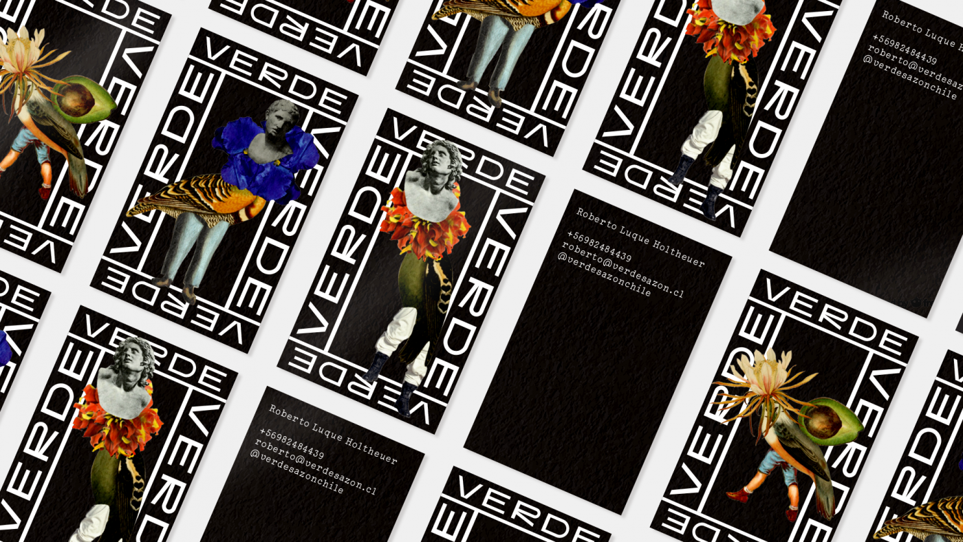
So, what would the identity be based upon? Since every dish is a unique creation, almost an experiment, we had to embody change and flux throughout the branding and visual language. We decided to develop playful characters using collage: while the characters are not meant to be too literal, they evoke the genesis of their dishes, claiming both the recipes and the multiform, ever-changing spirit of the restaurant. Each of the four elements composing the system stand for an idea. The animals for veganism, the plants and fruits for nature, the sculptures and human forms represent the passion and knowledge embedded in each recipe, and the flowers stand for uniqueness, delicacy, beauty.
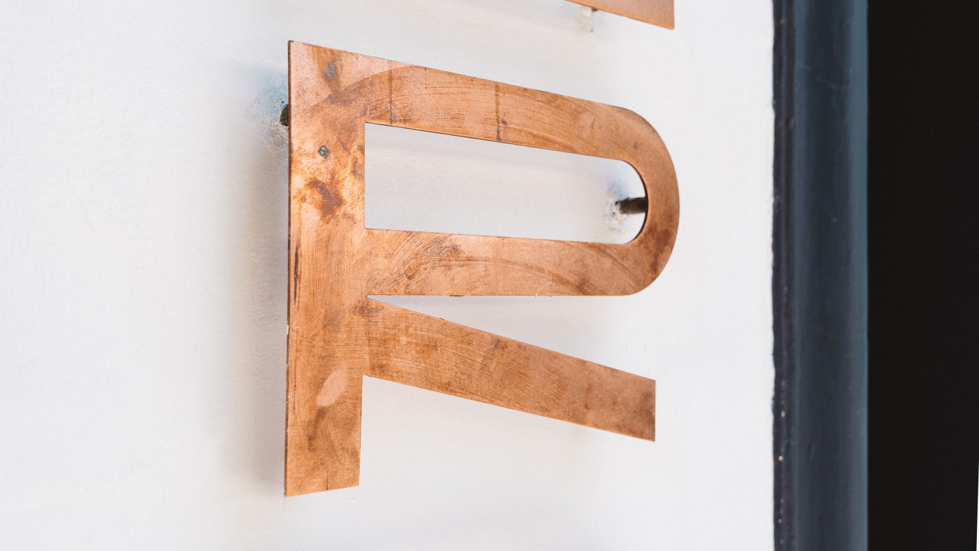
The identity is capped by the bespoke Sazón font, an all caps typeface inspired by the old Barrio Italia stores where the restaurant is located. When you create something by hand, like this font and those recipes, its imperfections are always on the dish. But they are exactly what make a place alive, real, and lovable.